One of the biggest mistakes product teams make is assuming that users are excited to use technology.
In reality, most users do not want to use technology. They want to get something done.
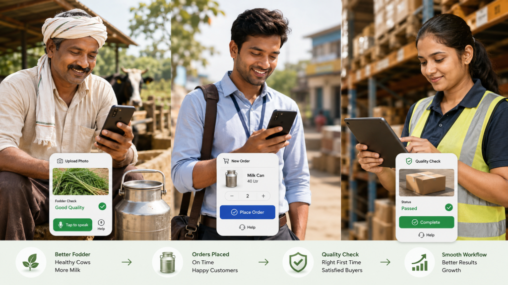
A farmer does not want to “use an app.” He wants fodder on time, better milk output, lower feed cost, and quick help when something goes wrong.
A field executive does not want to “update a dashboard.” He wants to complete visits, close orders, avoid confusion, and not spend his evening filling reports.
A production operator does not want to “follow a digital SOP.” He wants clear instructions, fewer mistakes, and confidence that his supervisor will not blame him later.
This is especially true when building products for Bharat, rural users, field teams, factory teams, logistics teams, and semi-digital workforces. In these environments, technology adoption does not happen because the software is feature-rich. It happens when the software reduces friction in daily work.
The product is not the app. The product is the outcome.
When we build technology, we often start with screens, modules, workflows, and dashboards.
But the user starts with a problem.
“Can I place an order easily?”
“Can I know what to do next?”
“Can I avoid calling five people?”
“Can I get paid faster?”
“Can I prove that I did the work?”
“Can I get help when I am stuck?”
If the product does not solve these questions, then no amount of beautiful UI will create adoption.
At Shunya, this thinking is very important. We are not building technology for people sitting behind laptops. We are building for farmers, production teams, sales teams, delivery partners, GLC operators, and rural entrepreneurs. Many of them may not think of themselves as “tech users.” But they are very clear about what they need: reliability, simplicity, trust, and visible benefit.
Do not begin with registration. Begin with value.
A common mistake in product design is forcing users to register before they experience any value.
For users who are already hesitant, registration becomes a wall.
Instead, the product should offer immediate utility.
For example, in a farmer-facing app, instead of saying:
“Register your farm, add animals, complete profile, then use features.”
A better approach could be:
“Upload a photo of your fodder, seed, or animal issue and get basic guidance.”
Once the user gets value, then ask for mobile number, location, farm details, or subscription. The sequence matters.
Trust first. Data later.
This is especially important in rural and semi-urban markets, where users may not understand why they are being asked to fill long forms. They may suspect misuse, lose interest, or simply hand the phone to someone else.
A simple rule is:
Do not ask for information before you have earned the right to ask for it.
Build for assisted adoption
Many users may not adopt a product independently, but they may adopt it with assistance.
This is not a weakness. It is a design reality.
In rural commerce, assisted ordering is often more powerful than self-service ordering. A farmer may not place the first order on the app, but a local sales partner can place it on his behalf. Over time, the farmer may start checking order status, wallet balance, or delivery history himself.
Similarly, a production worker may not start by exploring all modules of a production app. But if the app tells him exactly what task to do next, captures photo proof, and gives a clear pass/fail result, he will start using it because it helps him complete work.
Assisted adoption can happen through:
- field executives
- local partners
- call centres
- voice agents
- QR codes
- guided flows
- vernacular prompts
- supervisor-led usage
The goal should not be to make every user fully digital on day one. The goal should be to create a bridge from current behaviour to digital behaviour.
Reduce choices, increase clarity
Many technology products fail because they offer too many choices.
For a power user, choice feels like flexibility. For a hesitant user, choice feels like confusion.
A farmer opening an app should not see ten modules. A field executive should not be asked to decide between complex menu paths. A production worker should not have to interpret a long checklist.
The product should guide the user.
Instead of saying:
“Select module.”
Say:
“What do you want to do today?”
Instead of showing:
“Dashboard, reports, analytics, profile, settings, history.”
Show:
“Place order.”
“Check delivery.”
“Raise issue.”
“Upload photo for quality check.”
“Talk to expert.”
For internal teams, the same principle applies.
A sales executive may need only four actions:
- New customer order
- Existing customer visit
- Customer creation
- My targets
Everything else can stay in the background.
Good product design is not about showing everything. It is about showing the right thing at the right time.
Make the next action obvious
Users who do not want to use tech need guided journeys.
Every screen should answer three questions:
- What is this screen for?
- What do I need to do now?
- What happens after I do it?
If these three questions are not clear, the screen is weak.
For example, in a production SOP app, instead of showing a long list of process steps, the app can show:
Current task: Wash grain – Step 3
Instruction: Add Teepol as per SOP
Proof required: Upload water clarity photo
Next step: Supervisor approval
This reduces cognitive load. The user does not need to understand the entire system. He only needs to complete the next action correctly.
Use photos, voice, and local language
For many users, typing is friction.
Photos, voice, and local language can dramatically improve adoption.
A farmer may find it difficult to describe a cattle health issue in text, but he can upload an image. A production worker may not type a detailed deviation note, but he can record a voice note. A field executive may prefer Hindi prompts over English labels.
The future of mass adoption products will not be only form-based. It will be multimodal.
Instead of asking users to type everything, we should allow them to:
- click photos
- scan QR codes
- record voice
- select from visual options
- use local language
- get AI-assisted suggestions
- confirm with one tap
This is particularly relevant for AI products. AI should not feel like a separate feature. It should quietly reduce user effort.
For example:
A user uploads a photo of fodder.
The system asks: “What do you want to check?”
- Germination
- Fungus risk
- Growth quality
- Harvest readiness
- Animal feed issue
The AI gives a basic result, asks for missing information if needed, and recommends the next step.
This is more natural than asking the user to understand AI, prompts, or technical terminology.
Design for trust, not just efficiency
In many environments, users resist technology because they fear it will be used against them.
A field employee may think tracking means surveillance.
A production operator may think photo proof will only be used to blame him.
A farmer may think app data will be used to sell him something.
This is why communication matters.
The product must clearly show how it helps the user.
For a field executive, team tracking should be positioned as:
- proof of work
- better route planning
- faster support
- fair performance visibility
- fewer manual reports
For a production worker, SOP digitisation should be positioned as:
- step-by-step support
- fewer mistakes
- protection through evidence
- faster approvals
- better quality
For a farmer, data capture should be positioned as:
- better recommendations
- personalised service
- order reliability
- expert support
- possible loyalty or carbon benefits
Users adopt technology faster when they believe the system is on their side.
Build habit before complexity
A product should first create one small repeatable habit.
Once the habit is formed, more modules can be introduced.
For example:
A farmer may first use the app only to check delivery or raise a quality issue.
Later, he may use it to place orders.
Then he may check wallet balance.
Then he may upload animal health images.
Then he may subscribe to advisory.
Similarly, a production team may first use the app only for daily task completion.
Later, quality gates can be added.
Then IoT alerts.
Then AI-based growth prediction.
Then automated corrective action.
Adoption is not an event. It is a ladder.
The product should not push the user to climb all steps on day one.
Offline and low-connectivity design is not optional
For Bharat-scale products, connectivity cannot be assumed.
Many users operate in villages, warehouses, production units, highways, farms, and field locations where internet may be unstable. If the product fails every time the network drops, users will stop trusting it.
Important features should support:
- offline data entry
- auto-sync later
- low-data mode
- compressed image upload
- retry logic
- clear sync status
- SMS/WhatsApp fallback
- local caching of critical tasks
A product that works in imperfect conditions builds confidence.
A product that works only in ideal conditions becomes a demo product, not an operating product.
Dashboards are for managers. Actions are for users.
Many enterprise products are built from the manager’s perspective.
Managers want dashboards, reports, filters, and analytics. These are important. But the front-line user needs actions.
If a field executive opens the app and sees only performance charts, he may not care.
If he sees:
“3 follow-ups pending today”
“1 customer nearby”
“1 payment overdue”
“Target pending: ₹18,000”
“Next best action: visit Ramesh Dairy Farm”
then the product becomes useful.
Similarly, for production teams, a manager may need a dashboard showing GLC-wise performance, but the operator needs:
“Start soaking”
“Upload photo”
“Check water clarity”
“Mark batch ready”
“Call supervisor”
The best products separate manager intelligence from user action.
Make technology invisible
The highest form of adoption is when the user stops thinking about the technology.
UPI worked because users did not need to understand banking infrastructure.
WhatsApp worked because users did not need to understand messaging protocols.
Similarly, rural and operational tech products should hide complexity.
The user should not have to understand:
- AI models
- IoT architecture
- carbon MRV
- workflow engines
- analytics logic
- API integrations
- backend rules
The user should experience:
- one-tap action
- clear instruction
- quick response
- reliable service
- useful output
Technology should work in the background. Value should be visible in the foreground.
Build with the user’s real environment in mind
A product designed in an office often fails in the field.
In the real world:
- hands may be dirty
- the user may be in sunlight
- the phone may be low-end
- network may be weak
- the user may be in a hurry
- literacy levels may vary
- the user may be sharing the phone
- calls and WhatsApp may interrupt usage
- the user may not remember passwords
- the user may not know technical terms
This means product design should include:
- large buttons
- minimal typing
- clear icons
- local language
- voice support
- low-end phone compatibility
- simple login
- photo-first workflows
- visual confirmation
- error recovery
- assisted help
Great products are not built for ideal users. They are built for real users.
Measure adoption differently
For users who do not want to use tech, standard metrics may not be enough.
Instead of only tracking logins and screen views, measure:
- task completion rate
- time saved
- repeat usage
- assisted vs self-service usage
- drop-off points
- support calls reduced
- manual reporting reduced
- errors reduced
- orders completed
- issues resolved
- payments collected
- quality checks passed
The question is not: “Are people using the app?”
The better question is: “Is the app making their work easier and more reliable?”
The future belongs to operating systems, not apps
In sectors like agriculture, dairy, logistics, and rural commerce, the future will not be won by apps alone.
It will be won by operating systems that combine:
- mobile apps
- assisted workflows
- IoT
- AI
- field teams
- quality control
- payments
- logistics
- training
- dashboards
- human support
The user may only see one simple screen. But behind that screen, the system should coordinate many moving parts.
This is the real opportunity.
To build technology for users who do not want to use technology, we must stop selling technology as technology.
We must build products that feel like help.
Products that reduce confusion.
Products that guide the next action.
Products that work in local language.
Products that respect the user’s reality.
Products that create trust before demanding data.
Products that start simple and grow with the user.
The best technology is not the one users admire.
It is the one they quietly depend on every day.